Chart courtesy of @kikkerlaika
Regression is a dangerous word.
That’s especially true because with the increase in the popularity of measures like PDO, fans have become prone to yell the term in a (figurative) crowded theatre and then run away. Regression is the beginning of the discussion, not the end. Teams don’t all regress to the same values, or at the same rate. Basically, tread with caution.
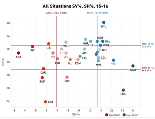
What I want to discuss briefly here though, is one particularly misuse of the term that I’ve seen on Twitter in the last few days, especially with regards to the Montreal canadiens. It stems from this chart
As you can see, Montreal is in the top right corner of the graph, indicating a likely unsustainably high shooting and save percentage. It’s easy to look at that and shout “regression”, but the graph is missing some important context.
Let’s think about what someone is really implying when they do this. The Canadiens sit pretty at 8-0. So the assumption is that the team is over-performing based on percentages and is due to regress to a more reasonable winning percentage.
But let’s look into these numbers a little more.
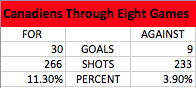
The Canadiens have the league’s fourth best shooting percentage and best save percentage thus far. Carey Price and Mike Condon’s combined .961 save percentage is outrageously high and, of course, no one could expect it to approach that for the rest of the season. But trying to connect a team’s record to its percentages this way misses the point.
The Habs beat the Buffalo Sabres last night 7-2. Sabres goalie Chad Johnson didn’t look particularly sharp, and against a better keeper maybe the Habs only would have put up three goals and won the game 3-2. In that case, the team would still be 8-0, but would only have a shooting percentage of 9.8 percent, which would be 14th league-wide.
The three prior wins were each by three goals. Carey Price was brilliant in all. Let’s say, though, that he had let in a few weak ones meaning two more goal against in each game. The team’s record would still be 8-0, but its save percentage would now be a reasonable 0.936, still high, but only barely in first place in the league, and remember Price put up a .933 last year. It’s not inconceivable that the team could approach that realm for the rest of the season.
So suddenly, the Canadiens’ percentages would appear a lot more normal, prone to less regression. Based on the above plot, the Canadiens’ start would seem more legitimate, and far fewer folks would scream the “r” word.
Is that fair? Is it rational? You see, what the percentages chart does is punish teams for scoring and preventing excess goals. It’s basically saying, “If you score or prevent more goals than you need to win, your winning is less sustainable,” which we in fact know to be the opposite of the case. In fact, it is one-goal wins that are the least sustainable.
So what is the solution? Well, in essence, percentage charts are looking at the wrong side of the issue. Goal scoring and preventing is a function of shot rates and shooting percentages. Rather than look at whether percentages might regress, look at the metric we know to be decently stable and a good predictor of success. Shot quality matters, but we know it matters far less than shot rates, and therefore — at least this early in the season — shot rates are the best quick way to examine a team’s start.
The Canadiens have a score-adjusted even-strength Corsi of 54.2 percent, suggestive of strong play. That’s as good of a reason as any to suggest that the Canadiens may be for real. It’s still early, but ignore all the noise and look at that.
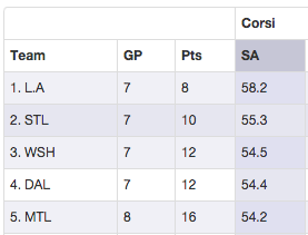
You can see the full ranks at Puck On Net here.
